Sperling’s BestPlaces has released a series of interactive choropleth maps on a dozen categories of information for each State, County, City, and Zip Code. From Cost of Living information to Commute Times, the interactive maps enable people to explore and learn about places all over the United States.
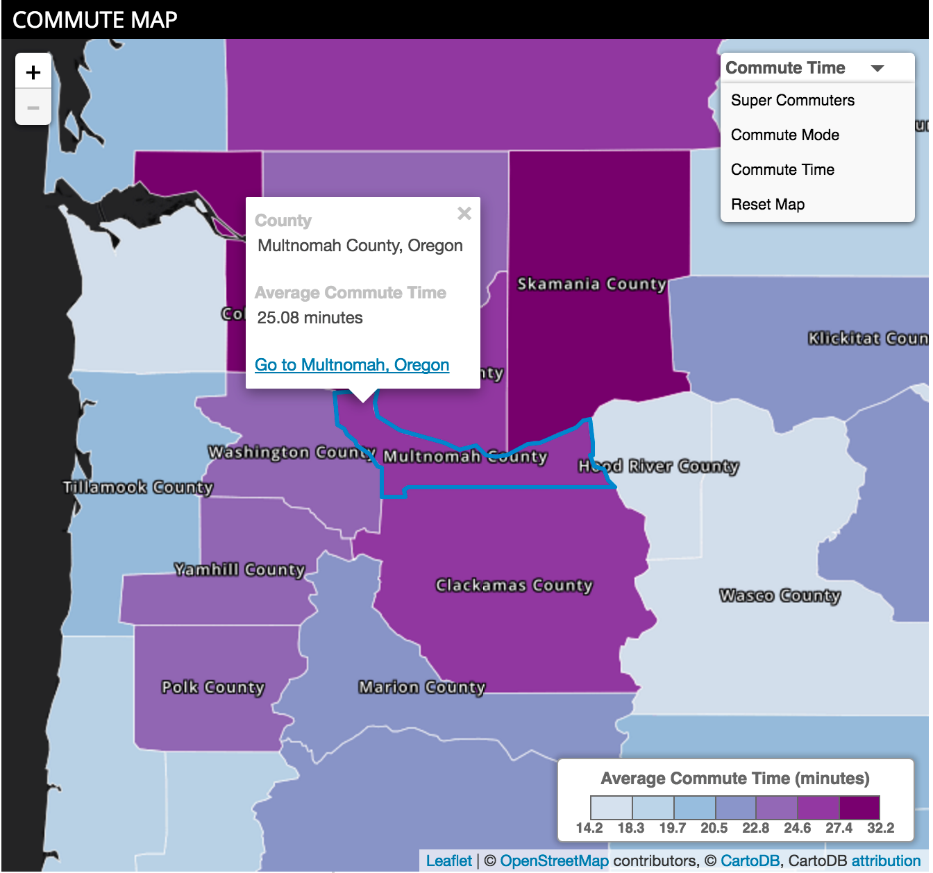
Choropleth representation is a thematic mapping technique where geographic areas are filled with colors that are in proportion to some underlying data about each area with the purpose of displaying a geographic pattern. The maps are easy to read and use, and display a lot of information.
You can explore 42 different datasets over 12 categories of information via the dropdown menu. You can pan around, zoom in and out, and reset the map to its original condition. If you want to change the data category, navigate to that category by using the left-hand navigation on the webpage. What’s more, you can click each place on our interactive maps to find out exact values. And, if you want to explore that particular place, follow the link to each places’ webpage.
Each map has been crafted to optimize performance and accessibility for everyone; they’re even smartphone friendly. Go to bestplaces.net, create a username and log in to view our maps.
About Sperling’s BestPlaces – Serving 2 million visitors a month, Sperling’s BestPlaces website www.bestplaces.net puts insights and facts in the hands of the public so they can make better decisions about best places to live, work, retire, play, or relocate.
